« Announcement: NetSci 2008 | Main | Is terrorism getting worse? A look at the data. (part 2) »
September 11, 2007
Is terrorism getting worse? A look at the data.
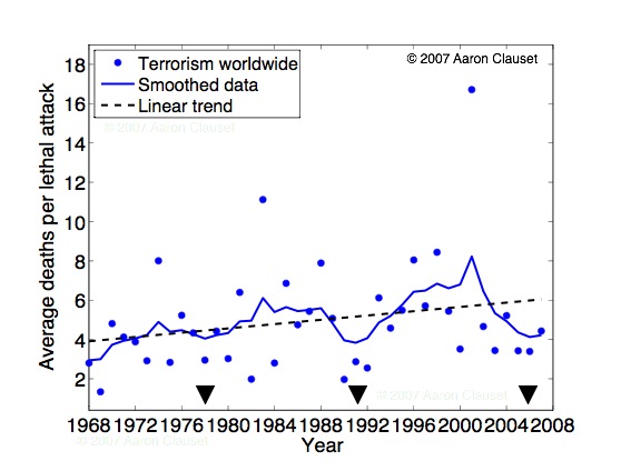
Data taken from the MIPT database and includes all events that list at least one death (10,936 events; 32.3% as of May 17, 2007). Scatter points are the average number of deaths for lethal attacks in a given year. Linear trend has a slope of roughly 1 additional death per 20 years, on average. (Obviously, a more informative characterization would be the distribution of deaths, which would give some sense of the variability about the average.) Smoothing was done using an exponential kernel, and black triangles indicate the years (1978, 1991 and 2006) of the local minima of the smoothed function. Other smoothing schemes give similar results, and the auto-correlation function on the scatter data indicates that the average severity of lethal attacks oscillates with a roughly 13 year periodicity. If this trend holds, note that 2006 was a low-point for lethal terrorism.

A. Clauset, M. Young and K. S. Gledistch, "On the Frequency of Severe Terrorist Attacks." Journal of Conflict Resolution 51(1): 58 - 88 (2007).
posted September 11, 2007 10:33 AM in Political Wonk | permalink
Comments
Suppose you looked instead at the total number of deaths due to terrorism by year, normalized by world population?
Posted by: Cosma at September 11, 2007 07:43 PM
In which case there would be quite a drop in terrorist deaths per global capita. (That was my first thought too, but Cosma beat me in making a comment :(
What about on a per country basis too?
Posted by: Matthew Berryman at September 12, 2007 04:24 AM
Great question - see the new entry.
Matt, regarding looking at it by country, that's tricky because there are over 180 countries that show up in the database. If should be possible to carve things up according to region, though...
Posted by: Aaron at September 12, 2007 08:59 AM